Strategic Health
for Enhanced Monitoring
Today we use two measures, KPI and progress, but the foundation is there to add more as time goes on. For instance, we are investigating the use of other soft metrics in the health calculation like number of people actively involved, the number of supporting documents, the frequency of activity, etc… We are also planning to include the current NPV/Cash flow into the equation.
Strategy Health Calculations
Health is calculated by taking each measure and calculating a variance of the current value from the expected value, in the range of -100 to 100. (e.g. absolutely bad to absolutely good), with 0 being the on-track value. Then that value is multiplied by the measure’s contribution amount as defined on the “Health” page in the “Tools” section. By default, all measures are given a weight of 1, but if you set the KPI variance contribution to 2, it will have twice the impact on health as progress.
The other values that can be tweaked on the administration page are the upper and lower bounds on the warning region (yellow area). This region is the border between good (green) and bad (red). By default the region is -20% to %20, following the logic that even though the health is on track, it’s only just meeting its targets. Users have the ability to change the positive and negative percentages individually. This limits green to 0% and greater, and red to anything less than 0% if you were to set both tolerance values to 0.
Besides the inclusion of more variables into the equation, we are also considering having a block-level override; that is, we understand that not all strategies are treated equal and some may value one variable over another depending on the strategy.
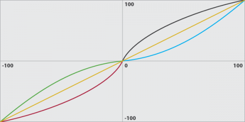
The last critical aspect of the health value is the priority skew. In simple terms, this skew is the method we use to increase the impact of health values. When a block has a higher priority, we want to make its health values appear more good and more bad than others. When a block has a lower priority, we want to minimize the impact of the health value, so we make values less good and less bad. So low priority blocks have their health pushed more to the yellow region, and high priority blocks have their health pushed away from the yellow regions.
In the above chart we try to illustrate an example of the skew curve. Both the x and y axes are limited to the range -100 to 100. The x-axis is the health value before the priority skew, and the y-axis is the health value after applying the skew. In our example, we show 3 different data series: priority 5, 1, and 9 from the range [0..10]. The orange line is the median priority (5) where y=x, meaning no skewing is being applied to the values. The red and black lines are high priority (9) where the curve slopes more quickly away from the median and then tapers off slowly. The blue and green lines are low priority (1) where the curve slopes more slowly than the median and then increases as it reaches 100. If you take the same chart and overlay all the priority curves, you end up with an onion effect.
It’s not Important to Worry About
the Precise Values in the Case of Health
The intention is not to provide users with a scientific metric, but rather to provide a rough indication for how well one particular strategy is performing when compared to the others:
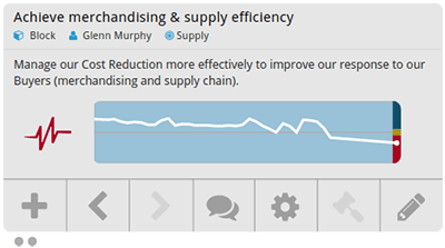
This chart shows the health view on a single block with a priority of 10. The white line charts the historic values, one per day from the block’s start date, and the triangle on the right shows the actual status today. Notice that the status is red and the white line is significantly below the grey 0-line. Now if we take the same block and change the priority to 0, the white line flattens out and the status becomes yellow.
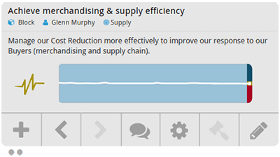
This illustrates two points. First, that priority has a significant effect on the resulting health value, and second, that comparing the health of multiple blocks can be done quickly and easily.