Feature Focus – Enhancements to Multi Chart Features
Following the release of the custom dashboard multi chart, we have had some great feedback from customers enabling us to add some extra features and functionality.
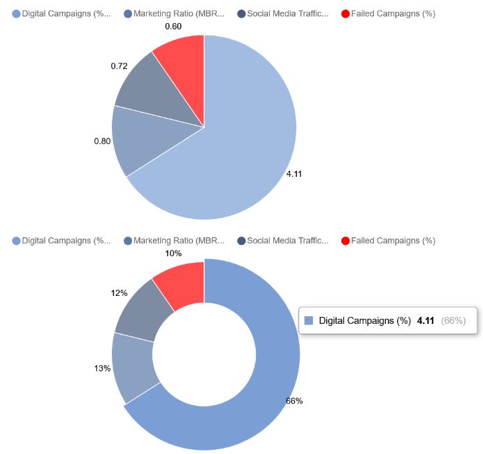
New Pie Chart (see above!)
Everyone seems to love a pie chart, so a couple of options have been added to complement the line, bar and stacked options already available. Your pie comes in 2 flavors, traditional or donut. Double clicking the multi chart object allows you to choose the chart style, whether you want to label segments with values, percentages, or no labels. In addition, you can simplify the data displayed by aggregating to a chosen time period (weekly, monthly etc.), and how that aggregation should be performed (average, maximum etc.).
The pie chart (like all the other StrategyBlocks custom dashboard charts) is fully interactive and hovering over a segment will provide additional detail.
Dual Y-Axis Mixed Combo Chart
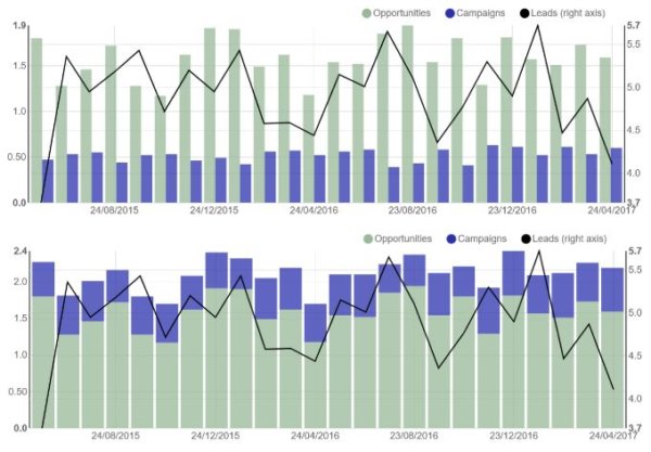
But often you need to display 2 sets of metrics data with very different value ranges. So we also added the mixed chart which features a second y-axis. The chart can either feature values stacked or grouped and offers the same aggregation options as the pie chart. You can choose metrics actuals separately from targets to provide additional flexibility, and shorten the labels for presentation purposes.

Grouping Options
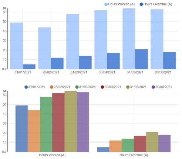
Data can now be grouped in 2 different ways, you can now either group the bars by date or by data series to provide additional options for comparison.

Color Picker
Finally, you can now customize the color of each data series in your multi chart. You can type in a specific color (in RGB hexadecimal format) or select from the swatch. Rather than try to remember the hex code for your next chart, and back by popular demand, is the ability to save that color in your palette for reuse in other parts of the custom dashboard.
If there are any specific charts that you need for your StrategyBlocks dashboards, please let us know.


Leave A Comment