
See Your KPIs at a Glance with the New Metrics Bullet Chart
In the dynamic world of strategy management, staying on top of key performance indicators (KPIs) is crucial for informed decision-making and achieving business objectives. StrategyBlocks is proud to introduce the new Bullet Chart feature in our Dashboards section, adding significant value to our existing suite of data visualization tools and enabling users to create presentation-quality dashboards.
Point-in-Time Reporting vs. Over Time
Understanding the current state of key metrics is just as important as tracking their progression over time. The Bullet Chart excels at providing a clear, concise snapshot of KPIs at any given point. This feature allows users to instantly grasp the status of critical metrics, enabling swift and informed decision-making. Unlike traditional charts that emphasize trends and patterns over time, the Bullet Chart is designed to offer a focused view of where your metrics stand right now.
Enhancing Current Displays
Before the introduction of the Bullet Chart, StrategyBlocks offered several powerful tools for visualizing metrics: Bar Charts and Sparklines. Each has its strengths: Bar Charts provide a straightforward comparison of values, while Sparklines offer a compact view of data trends. The Bullet Chart complements these existing options by adding a new dimension to data visualization. It combines the best elements of both, presenting a single, visually intuitive representation of performance against targets.
Business Need for Point-in-Time Reporting
In today’s fast-paced business environment, executives and managers need real-time insights to make timely decisions. Point-in-time reporting of KPIs addresses this need by providing a snapshot of performance, highlighting areas that require immediate attention. This is valuable not only to business decision-makers but also to stakeholders, the public, and shareholders who seek a quick snapshot of the current state. Whether you are assessing the health of a project, monitoring financial targets, or evaluating operational efficiency, the Bullet Chart’s ability to convey critical information quickly and clearly is invaluable.
Available for Block Progress
The introduction of the Bullet Chart for metrics builds on the success of its application in block progress reporting. Users have already experienced the benefits of this versatile tool in tracking project milestones and progress. Now, the same clarity and precision are available for a broader range of metrics, enhancing the overall functionality and utility of StrategyBlocks.
The Power of Bullet Charts
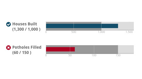
Developed by visualization expert Stephen Few, the Bullet Chart is designed to convey a wealth of information in a compact, easy-to-read format. In StrategyBlocks, we utilize the Bullet Chart with two key values: the latest target value and the latest actual value. This comparison is the essence of the Bullet Chart’s power, allowing users to quickly see how performance measures up against targets. We use color changes to represent the status of the metric actual—whether it is ahead, behind, or on target—providing an immediate visual cue to the viewer.
Adding Value to Your Dashboard
Integrating the Bullet Chart into StrategyBlocks dashboards enriches the user experience by providing a powerful new tool for data presentation. Users can now create presentation-quality dashboards that not only look impressive but also convey essential information clearly and effectively. The addition of the Bullet Chart enhances the comprehensiveness and versatility of StrategyBlocks, making it an indispensable tool for strategic management.
The new Bullet Chart feature in StrategyBlocks represents a significant advancement in KPI reporting and visualization. By offering a clear, concise view of current metrics alongside our existing Bar Charts and Sparklines, we are empowering users to make better, faster decisions. Embrace the future of strategic management with StrategyBlocks and its innovative new Bullet Chart feature.
Leave A Comment